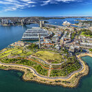
DeafScape Principles in Public Spaces

Alexa-Vaughn-DeafScape
Curated by Alexa Vaughn

Alexa Vaughn, Associate ASLA, is a Deaf landscape designer in OLIN’s Los Angeles office and a 2020-2021 LAF Fellow. Her research on designing with disabled people began with an inquiry into her own identity and use of public space, through her widely featured article DeafScape: Applying DeafSpace to Landscape. DeafScape is the application of Gallaudet University’s DeafSpace Design Guidelines (DSDG) to the greater urban landscape. The goal of DeafSpace is to create places where Deaf and Hard of Hearing people can communicate with ease, comfortably use and enjoy space, and Deaf culture can flourish. Although the DSDG are focused predominantly on architecture and interiors, Vaughn discovered a number of ways the principles could be applied to the greater landscape. These design principles emphasize spatial understanding and use by employing elements and tactics that take advantage of sensory experiences that are visual, tactile, and even olfactory. By employing these principles, designers have the power to create a more accessible–and beautiful–public realm. The eight projects below illustrate key elements from Vaughn’s DeafScape principles, which can be applied to any design in a multitude of ways.

  1. Case Study Brief

    Barangaroo Reserve

    Sydney, New South Wales, Australia

    “Textured Transition: The first principle of DeafScape design is the creation of textured transition areas to provide cues between sidewalks, planting areas, and streets. These subtle tactile cues are crucial for the Blind and DeafBlind communities; they differentiate between edges of the ground plane and thresholds and offer safety cues along edges of curbs. They can be tangibly felt by feet, canes, and wheels as a form of warning along curbs, particularly when streets are tabled flush with sidewalks. Barangaroo Reserve’s linear textured areas with tactile and visual contrast help users to navigate the site - subtly and beautifully - particularly around the site’s edges. The texture may serve as an informal safety mechanism as well, protecting Blind and low-vision site users from falling into the water. ”
  2. Case Study Brief

    Goods Line_After

    The Goods Line (North)

    Ultimo, New South Wales, Australia

    “Shoulder Zone: The second principle of DeafScape design is the provision of ‘shoulder zones’ to create a buffer zone between the sidewalk and the street (or similar spaces, with bustling activity). Shoulder zones are dedicated areas parallel to busy pathways, which serve as a space for signage, lighting, seating, furnishings, and plantings, to prevent obstructions from jutting into the main path of circulation. They also serve as a space to step off of the main path to communicate, check phones, take a seat, lock a bike, or throw away trash, and they are particularly useful for Deaf and Hard of Hearing people to have a space off of the sidewalk to stop and communicate. The Goods Line utilizes a number of eclectic shoulder zones which incorporate different forms of seating, planting, and other furnishings and fixtures. These create a wide variety of choices for pedestrians to move safely off of the main path of circulation and comfortably pursue moments of rest and communication. They also help to keep circulation free of barriers.”
  3. Case Study Brief

    Chicago Riverwalk, Phases 2 & 3

    Chicago, Illinois

    “Degree of Enclosure: The third principle of DeafScape design, a degree of enclosure, creates a secure, semi-private space to see and be seen. These can be provided along the edges of major pathways to provide security at the back and an open view at the front, towards public activity, which can be crucial for comfort. These spaces also offer room to move off of the main path to converse and relax while limiting obstructions. Chicago Riverwalk features one type of enclosure in the form of custom wood tall-backed wooden benches which allow site users to sit and view the river and passersby. Other examples of degrees of enclosure include alcoves, tall planting beds around seating, and other outdoor rooms and shelters such as parklets, which have one to three walls.”
  4. Case Study Brief

    Railroad Park_After

    Railroad Park

    Birmingham, Alabama

    “Night Lighting: The fourth principle of DeafScape design is night lighting. Although often viewed as common sense, good lighting is necessary and must be well thought out to create safer, more visible spaces after dark. Light can be used artfully to create subtle clues, wayfinding, and areas to gather in a site’s design, long after the sun has set. Lighting should be maximized to prevent eye strain but also avoid creating too much glare, which is necessary for Deaf and Hard of Hearing folks reliant on visual communication (ASL and/or lip-reading). Railroad Park’s pavilions provide a good amount of light that is direct enough to improve vision at night, but soft enough to give a warm glow without a disconcerting glare, creating spaces where people can congregate together comfortably in the evening.”
  5. Case Study Brief

    Director Park-After

    Simon and Helen Director Park

    Portland, Oregon

    “Flexible Seating: The fifth principle of DeafScape design is flexible seating, which can accommodate small to large groups joining in conversation. This is another principle of design viewed as common sense, but it plays an important role in people’s use of the public realm- they should be durable but light enough to move, and when paired with circular or U-Shaped tables can greatly aid Deaf and Hard of Hearing folks to communicate comfortably. Simon and Helen Director Park’s design features, including movable tables and chairs, can be artfully arranged to comfortably accommodate myriad park users. They can be moved throughout the bustling site to accommodate a multitude of programming, allowing users to be near the park’s playful water feature, under the pavilion for light shade, or to eat al fresco by the café.”
  6. Case Study Brief

    Pompano-After

    Pompano Beach Boulevard Streetscape and Dune Restoration

    Pompano Beach, Florida

    “Wider Pathways: The sixth principle of DeafScape design is wider pathways with a minimum of 10 feet to provide space for conversation and circulation. Space to sign and use visual communication is very important for the Deaf community, and also for folks who use wheelchairs or other assistive devices, Blind folks who use canes or guide dogs, and neurodivergent folks who need a sensory buffer from bustling streets. Dependent on place, smaller corridors can be a minimum of 7-8 feet wide, but the wider the paths are, the better, to enhance ease of movement through circulatory paths, particularly areas with high pedestrian traffic. Pompano Beach Boulevard features a 17-foot-wide space to pass through, to the benefit of pedestrians, joggers, and cyclists. Stone benches are plentiful to provide areas for rest, and are set off of the sidewalk to avoid obstruction.”
  7. Case Study Brief

    Wilmington-After

    Port of Los Angeles Wilmington Waterfront Park

    Wilmington, California

    “Rhythm: The seventh principle of DeafScape design is rhythm, which creates visual patterns along sidewalk edges to aid in spatial understanding and wayfinding. Rhythm can be used to provide visual references and alignment, which are continuous and recognizable, and which allow people to more easily move through a space. Rhythmic elements also serve as a visual cue, particularly for Deaf folks who can catch them in peripheral vision, helping to sign while walking. Tree placement and other wayfinding elements such as sculpture, posts, and signage help to create eye-catching patterns in the landscape. Wilmington Waterfront Park features two elements of rhythm in design, including a more traditional allée of trees and the pop of red sculptural posts, which provide stimulating movement through the site and ease navigation.”
  8. Case Study Brief

    P Street_After

    P Street Corridor, Phase 1

    Lincoln, Nebraska

    “Visual Cues: The eighth principle of DeafScape design is visual cues, which increase awareness and safety, especially at busy intersections. Visual cues come in many forms, but ultimately provide shared sensory reach for pedestrians, which is deeply rooted practice in Deaf culture. They can create visible hierarchy through materials, planting, and topography, aiding in transition between thresholds of spaces, and they can be paired with tactile cues like textured transitions. Visible color and material contrast can provide more ease in visual orientation and wayfinding in the public realm. P Street Corridor features a number of visual cues such as wide bump-outs at crosswalks, which reclaim pedestrian space and increase visibility to cars; colorful textured plantings; contrasting-color materials; and fixed wall furnishings. All of these elements move pedestrians safely and comfortably on the sidewalk and when crossing the street.”
Topics

Access & equity, Social equity

Help build the LPS: Find out how to submit a case study and other ways to contribute.